Hello, you.
Right, further to our lovely infographic from the other week, we need to update the tech provider projected market share figures. While we’re at it, we took the time to really make some additional changes and widen the set to give a fuller view of the market. We’re still not breaking it down by individual providers; that’s for another (much bigger) graph.
A quick health warning. The ‘future’ graph below is done on constant market share terms. That is to say, we assume the market size and split between providers remains constant over time. So if we know, for example, that one big adviser firm is planning to move £500m from here to there, or whatever, we don’t include that. This only includes replatforming activity that is in the public domain. So the future look is literally just to show how the current market split by tech provider changes once all the existing replatforming gigs work their way through the system.
In this version we have:
- Brought all of SEI’s £32bn of advised assets in (included in Proprietary/Other)
- Brought Pershing’s advised assets in (included in Proprietary/Other)
- Brought HL’s Portfolio Management Service in (all Proprietary/Other)
- Brought SJP’s book in (25% on IFDS already, the rest still to move from, you guessed it, Proprietary/Other)
So here we go for the current picture:
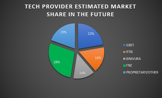
And here’s the future one:
Things to note: look at what a difference the SJP move makes. The Prop/Other future pie slice in this future look has a lot of SEI in it, along with some stalwarts like Transact and others. The IFDS slice shows Cofunds coming off (onto GBST), and SJP coming on – it is 14% of the whole market by itself.
If we were projecting how the market will actually look, rather than this artificial spool forward, we’d expect to see a lot more SEI and other facilitator-style platforms in there, as you can read here and here.
And that’s it for now. Hope it’s useful.


