If the definition of insanity is doing the same thing over and over again and expecting a different result, then financial services has gone well and truly mad. Having joined the industry around two months ago, this has been my overwhelming impression of the tired-old lines and scary figures that the industry constantly churns out for the supposed benefit of savers. I’ll continue to be brutally honest by pointing out that most ordinary people already find personal finance issues pretty damn dull, with younger generations in particular becoming increasingly disengaged when it comes to their finances. So why continue to feed them the same information over and over again when it’s clear that something that we’re doing just isn’t resonating?
Information can often be overwhelming, so it’s not surprising that many people feel turned off by this type of communication. Take the constant drone from the financial sector telling people like me (#TeamMillennial) that we’re not saving enough for retirement and that if we’re not careful we’ll be destined for a poverty stricken dotage. Yawn. I expect I’m not alone when I say this type of communication has the opposite desired effect. I just turn off. As I say, I’ve not been in the industry for long but I’m already exhausted by these lazy numbers telling me I need to save hundreds and hundreds of pounds every single month, in order to support myself when I eventually stop working. All too often, these figures are so high they feel totally irrelevant to someone my age, leaving many like me with the impression that they must have somehow been plucked out of thin air. The result? Yet another disengaged potential saver scared off by numbers that, in isolation, appear totally unachievable. It’s true that people my age may share the same priorities, saving for a deposit, wedding or starting a family – as older generations but we also face specific challenges such as crippling student debt and hefty house deposits. The industry should be presenting financial figures in a way that actually reflects our real lives and aspirations in this way, suggesting positive alternatives and encouraging good behaviour instead of the usual scare stories, wherever possible.
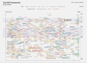
How do I suggest we do this? Data Visualisation. DataViz, as it is often referred to, can communicate financial matters in a language that younger generations (actually ALL generations) can understand by presenting a much wider context in a way that is both easily digestible and engaging. Having studied maths at university, I’m one of those weird people who start to smile when handed large sets of data. So you can imagine my excitement when I was given the opportunity to attend a DataViz workshop given by David McCandless in London (@mccandelish). By applying some sort of wizardry David transforms otherwise dull information into eye-catching graphics and intuitive diagrams that tell beautifully simple stories and stand out against the influx of data we are faced with on a daily basis. For anyone who doesn’t know who he is, his work is definitely worth checking out http://www.informationisbeautiful.net/.

DataViz is all about creating images to help people understand the world. A visualisation might be created for any of a range of purposes: to inform clients and help them make a decision, to raise awareness of important issues, to highlight data gaps or purely for entertainment. Whichever it is David’s workshop guided us through some steps to help us get to the end product.
So, what makes a good data visualisation? As with many things it can be easiest to start at the beginning, with a question, then develop your concept to lead to a goal or the answer. Ideally here the ideas will start to flow and we can begin to sketch our design. But, it is important to keep in mind that however good your ideas and designs might be, they are nothing without robust data to back them up.
This journey can become frustrating as your data might not want to tell the story you had originally envisaged. Or perhaps you’ll stumble across a hidden message and end up with a completely different outcome. Data visualisation has a wonderful way of leading you down one path and then suddenly revealing another direction you could take.
A common misconception is that it’s just us data geeks creating these graphics but in actual fact there was a well-balanced audience of journalists, researchers and a sprinkling of the more technical programmers at the workshop, all equally enthusiastic to harness David’s creativity. The process actually works so much better with a combination of people from different backgrounds.
Whatever happens along the way, and however you find yourself at the end visualisation, it’s hard not to get caught up in the excitement that something memorable can be created which, for financial services, could also mean the difference between engaging savers or shutting them off entirely.


